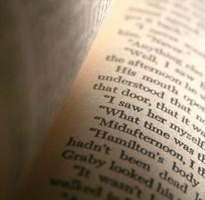
According to (Walsh 2006), a word that forms into a sentence is called print-based text. Images which appear on electronic devices that come with words are usually called multimodal text.
What is print-based text? Books, newspaper, magazine normally appear in traditional print-based text. Nevertheless, multimodal text are images combines with texts, hyperlinks, videos, logos, menu bars and etc which allows readers to read through Internet sites.
Designing a page for print document and screen, it is very important on how you select a suitable font. According to (Rob 2008), it is a great thing to establish a brand and look which is recognizable to your customer using a simple font. Example: Arial and Times New Roman can be easily readable on the hard copy.
Through the screen, web fonts are easily understandable and yet easy to read.
Verdana or Georgia fonts normally chosen by the web designer to design the web cause of it smoothness appear in pixels and readable compare to others.

Print Document Fonts: Times New Roman

Screen Document Fonts: Verdana
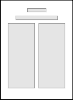
According to (Hilligoss 2002), the layout of print document has three alignments. Left alignment represent the standard for the body text in document which appears to be objective. Right alignments normally are use for some expressive documents. Centre forms will forms a formal and conservative tone like event invitation.
Balance : Symmetry
Weblog with Balance : Symmetry format
According to (Farkas, 2005), Print document is a form of hierarchical. From a wide topic shape into more detailed information. Links stands an important role for navigation in the screen document with sentences of words.

Screen document with Hyperlink
References:
- Farkas. 2005. Explicit Structure in Print and On-Screen Documents [online]. [Accessed 29 August 2011]. Available from: http://www.ablongman.com/mycomplab_content/pdf/long_hilligoss.pdf
- Hilligoss, Susan. Howard, Tharon. 2002 . Visual Communication A writer's guide. Second Edition [online]. [Accessed 29 August 2011]. Available from: http://www.ablongman.com/mycomplab_content/pdf/long_hilligoss.pdf
- Rob. 2008. Web vs Print : Fonts [online]. [Accessed 29 August 2011]. Available from: http://arrowquick.com/blog/2008/03/02/web-vs-print-fonts/
- Walsh, M 2006, ‘The ‘textual shift’: Examining the reading process with print, visual and multimodal texts’, Australian Journal of Language and Literacy, vol.29, no.1, pg.24-37.


No comments:
Post a Comment